Wednesday, 25 November 2015

Beastly Verse by Joohee Yoon


Joohee Yoon has printed her beautiful book in three colours, as they overlap they create a kaleidoscope of hues.


Using vivd red,teal and yellow, they overlap to create pinks, greens, purples. By using limited colour, it makes the other colours that are achieved out of them a wonder, a grift and fresh. 
Her clever use of white space also contributes to the image composition.
She illustrates popular poems, some short some long but all full of visual excellency. 

Here, a short poem about (clearly) a hyena...
The Happy Hyena
There once was a happy hyena,
Who played on an old concertina.
He dressed very well,
And in his lapel
He carelessly stuck a verbena.
-Carolyn Wells
He is shown in a town, a great reference point for my buildings for my play mat. The hyena is for focus, much larger and dancing across the page as though his music is though out the town and heard from every window.


She has used different textures here, a powdery dot texture like the effects left over from printing ink, thick lines that could have been made by a brush or thick marker, And the speckled dots on the shaker and eel. The shape of the leaves contrast with the lines of the background, and the white of the plate brings the image to unity.
The Eel
I don’t mind eels
Except as meals.
And the way they feels
- Ogden Nash


She says that many poetry books swuish too much text together, she wanted to create something where text and image were equal. She found it a challenge to provide only a page for each poem, and over cmd this by having fold out pages and flip pages where the story was continued in a change to the illustration. (1)

1.http://blog.picturebookmakers.com/post/116379961701/joohee-yoon

Practice with lines

Use different lines to explore form, play with control, thickness, texture.
Analise balance, tension.

Tuesday, 10 November 2015

sketches

from a walk,

Houses
roof tops and bay windows.

Church
 Christ Church

Houses
 On Montpellier. Ornate windows, plant pots scattered up stairs. Metal work balconies and door covers.
Shops

Shops

Shops

Florists
SHOP

Hairdressers and cheltenham college

Post office, with shop decoration of post boy

Shop front layout 

Wednesday, 4 November 2015

Artists


Limited colour and bold images.

Marc Boutavant
french - based in paris
(1)http://www.heartagency.com/artist/MarcBoutavant/gallery/1/image/2515
(2)http://frenchculture.org/books/authors-on-tour/marc-boutavant-0


i like the use of texture and characters within his work. 
He uses simple Photoshop tools to create heartwarming images.


Toby Morison
(3) http://www.tobymorison.com

 His lines are in pencil, and usually don't line up with the colour, a remission of the misregistration in printing. It adds an organic feel and that of imperfection.
Started in London, Studied at Uni of Westminster and MA at Royal College of art whilst freelancing for newspapers and magazine. 
Recently relocated to New York.
These images are from a book about a bird who can't fly and catches the plane instead.


Elena Odriozola
(4)http://elenaodriozolailustration.tictail.com
Based in San Sebastian. Basque country. Spain. 
She studied decoration and wired for eight years in a publicity agency, becoming an art director in the last few years.
"I believe the most important thing to me in work is freedom; freedom to express myself. Without that it would be impossible to create a good piece of work"

Great texture in the jumper and simple shape. Bold green and red colours.


Marina Sagona 
(5) http://www.nerillustrationagency.com/marina-sagona/
works in gouache and brush, and touching up in Photoshop.
Bold, simple colours. 


Isabelle Vanenabeele


Rosie the hen


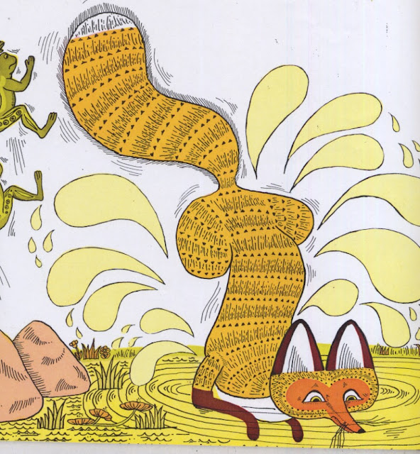
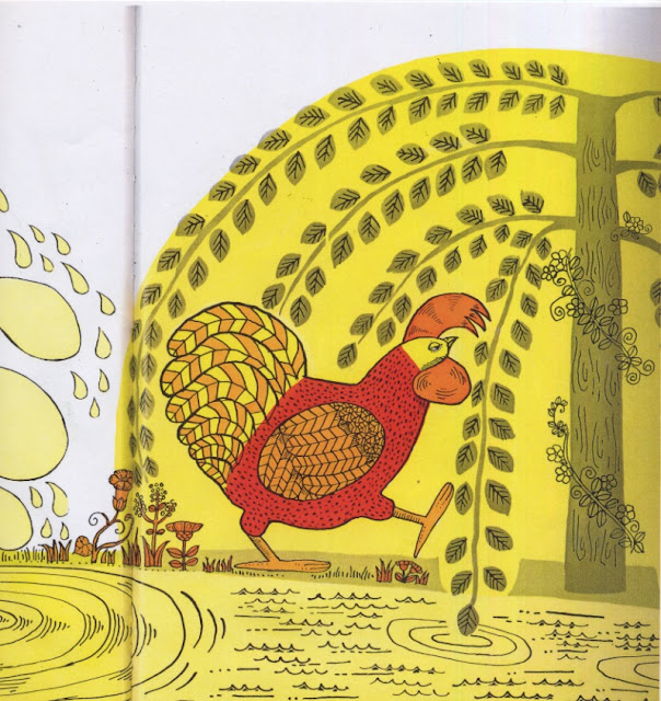
Rosie the Hen, limited colour pallet and brilliant use of form.  The earthly colours could become muddy and uninteresting, but the bright red hen walking through the pages, with the slinky patterned fox, is composed on each page with text in a way that it changes and a new surprise on each turn.


Big water drops and movement lines, very comic like. 


Different tones of yellow in the tree and pond.

Poor fox getting beaten up on each turn. he can never quite reach the hen. The movement in his body and tail I find mesmerising, and the high use of pattern distinguishes him from the trees and floor.


Here there is predominately yellow on the page, broken up by orange and olive green. the detail is in the lines, which break up the image into distinguishable forms. 
http://naomipowellplanningandpitch.blogspot.co.uk
The beginning! Research and idea start.