Tuesday, 22 March 2016

Layout planning

I have the basic shapes of the houses, and i've been playing around with how they might lay on the mat. If I work towards the end with a design in mind, rather than experimenting until it comes together.... will that work?

I have used simple shapes and windows just to get an idea of how they might create roads in the negative space.


Sunday, 20 March 2016

Inspiration

walkyland.com -  
http://walkyland.tumblr.com/

monika forsberg, swedish born but living in London.
She uses bold colours, collage and cutouts and a flat approach to design.
She has used white pencil ontop of the houses, with simplified symbols for leaves and foliage. She has retained detail in the facade of the house and brick walls. 
Colours are bright, in pinks, yellows and greens. 

Flowers are simple but effective, with details remaining in the shape of the leaf and texture of swirls . 

the fruit is bright, and you only need a few of them to make it clear that there are numerous produce to select from. 

There is a slight perspective on the side of the buildings, which give it a childlike aspect. The colour combinations of hot pink and orange clash and are exciting. They contrast with the darker tones of blue and again contrast with the zingy green.

Tuesday, 9 February 2016

instagram Inspiration

Bright and bold, with limited colours of blue, peach, green red and white. Use of negative space is also important.

Orange and ink, very effective. We have the colours available in the riso- printer and so I could try to create a similar piece for my houses poster.

Pink envelopes with a character on the outside - eye catching.

simple and childish, a whet house with red print. 

A painting, a tall wonky house and small windows adds character to the object.

a flyer with pink green and yellow, detail is in line and texture.


chinese match box, red and yellow with blue/black line.


shop front, showing tile pattern and typography.


Louise Lockhart, daily activities such as washing 


simple, bold. title details such as squares to represent windows and triangles for roofs plug into the very first shapes we learn when we are younger.

zingy yellow contrasted with a deep blue, simple veg and plants are shown by their shape and texture - see the onion shown cut in half to show all its layers...more visually pleasing than one unpeeled. The sharp contrast in the radish where the white space has been used.


limited colour palette of red, blue and cream page. The small variation between the white and cream gives a subtle extra colour without overwhelming an keeping the image simple.


shapes, overlapping, college, textures.


playful use of texture from apparent crayons or pencil, making repetitive patterns engaging.


pinks, greens, yellows, the colours work well and the use of an abstract background with a simple but detailed line drawing.

Saturday, 16 January 2016

Some photo references

Here are some other shapes and building types I could include in my project. ...


portsmouth, colourful houses, each in a different pastel tone. 


portsmouth, symmetrical windows. The levels of the windows are interesting, how is the inside laid out? 


Cheltenham suffolks market, signs and colours. The amount of detail in the stall makes you almost not notice the two figures, whose black clothing make them separate from the reds and yellows of the games. 

Gloucester, intricate tiling and type. The old font used carries the curves repeated in the door arches and window decor, contrasted by the squareness of the upstairs windows which seem static compares to the fluidity of the ground level. 

Gloucester, interesting roofs. Someone wanted a fancy dormer window....

Cheltenham flowers, could use to separate from the buildings. 

Suffolks butcher ft. bike. Contrast between red and green. 

Bath with wall writing. The difference in the windows on the two levels - long and then shorter. Most interesting is the faded painted type, adding texture to the battered stone walls.

Thursday, 14 January 2016

http://inkygoodness.com/blog/artists/artist-tim-biskup-travels-to-stunning-belize-on-the-jaunt/
http://www.timbiskup.com/wop/5y9lkybi3569csj1tk3qrmjyxfhquk


The colours! The shapes! Look how they over lap, intertwine and interact with each other to make a dynamic image that draws you in, looking at each section. The movement across the page, the balance of colours and edges. A visual feast.

Using ‘Around the world in 80 days’ as a starting point, ..... looked up the exact locations named in the books and found them on Google Street Maps. Included at the bottom left is even the Google yellow man. Its great to create something new from a technology people are reliant on and make it inspiring. Does it make it less impactful that the artist used Google search? Or should he actually have travelled there in person? Either way, the images are bright and colourful, with the hand written font adding to the feeling of it being a signed sketch put into the post.


Monday, 11 January 2016

Some inked houses, now to play with colours and make some more!
Tall houses for people who love stairs. 

Fun house with tree ladder and cat walkways.

Fancy house with balcony 

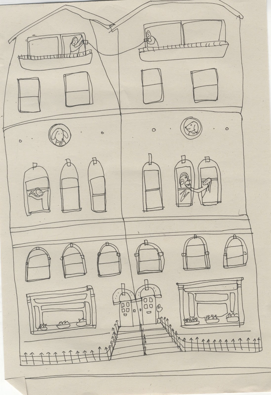
best friends house, talking through string cups in the morning. Even the pets are friends.